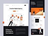
Website Design Inspiration: Igniting Creativity and Captivating Audiences
In the vast digital landscape, where countless websites compete for attention, it is essential for businesses and individuals to stand out from the crowd. One powerful way to achieve this is through captivating website design. A well-designed website not only enhances user experience but also leaves a lasting impression on visitors. This is where website design inspiration plays a crucial role.
Website design inspiration serves as a catalyst for creativity, helping designers and developers think outside the box and push boundaries. It provides a wealth of ideas, trends, and innovative approaches that can be adapted and incorporated into unique designs.
One of the primary sources of inspiration is exploring other websites in various industries. By studying successful websites, designers can gain insights into effective layouts, color schemes, typography choices, and navigation techniques. Admiring the work of others can spark new ideas and perspectives that lead to fresh and engaging designs.
Another valuable source of inspiration is staying up-to-date with current design trends. The ever-evolving nature of technology brings forth new possibilities and aesthetics in website design. From minimalistic designs with ample white space to bold and vibrant visuals, keeping abreast of trends allows designers to create modern and visually appealing websites.
Beyond industry-specific websites and trends, drawing inspiration from other creative disciplines can also be fruitful. Exploring art galleries, photography portfolios, or even fashion magazines can trigger unique ideas for website layouts or color palettes. The fusion of different artistic influences often results in visually stunning websites that captivate audiences.
Nature itself can serve as an abundant source of inspiration. The organic shapes found in landscapes or the harmonious color combinations seen in flora can be translated into elegant designs that evoke a sense of serenity or energy. Nature-inspired elements add depth and character to a website while creating an emotional connection with users.
Furthermore, engaging with online communities dedicated to web design allows designers to stay connected with fellow professionals who share their passion. These communities provide platforms for sharing ideas, seeking feedback, and discovering new design techniques. Collaborating with like-minded individuals can fuel creativity and lead to groundbreaking designs.
While drawing inspiration is essential, it is equally vital to infuse one’s unique style and brand identity into the design process. Inspiration should serve as a springboard for innovation rather than a mere replication of existing designs. By combining inspiration with personal flair, designers can create websites that are not only visually stunning but also authentic representations of their clients’ visions.
In conclusion, website design inspiration acts as a catalyst for creativity in the digital realm. By exploring various sources such as successful websites, design trends, other artistic disciplines, nature, and online communities, designers can unlock their creative potential and create captivating websites that leave a lasting impact on visitors. Embracing inspiration while infusing personal style leads to unique designs that stand out in the competitive online landscape. So let your imagination soar, explore the world of design inspiration, and craft exceptional websites that engage and inspire audiences.
9 Tips for Finding Website Design Inspiration
- Look at your competitors’ websites for ideas.
- Think about what you want the website to accomplish and design around that goal.
- Use a color palette that matches your brand identity and is pleasing to the eye.
- Keep navigation simple and intuitive so users can find what they need quickly and easily.
- Consider using videos or animations to engage visitors on your website.
- Incorporate whitespace into your design to make it easier to read content and navigate the site more effectively
- Use high-quality images throughout the website, but be sure they are relevant to the message you are trying to convey
- Keep text short and concise so that visitors don’t get overwhelmed by too much information
- Test out different layouts before settling on one – this will help ensure it works well for both desktop and mobile users
Look at your competitors’ websites for ideas.
Looking at Your Competitors’ Websites for Design Inspiration: A Smart Move
When it comes to website design inspiration, one valuable tip that should not be overlooked is exploring your competitors’ websites. While it may seem counterintuitive to seek ideas from rivals, this approach can actually provide valuable insights and help you stay ahead in the digital race.
By examining your competitors’ websites, you gain a deeper understanding of what works well in your industry. It allows you to identify design elements, layouts, and functionalities that resonate with your target audience. This knowledge can guide you in making informed decisions about your own website design strategy.
Analyzing competitor websites also helps you identify areas where you can differentiate yourself. By observing their strengths and weaknesses, you can find opportunities to enhance user experience and offer unique features or content that set you apart from the competition.
However, it is important to note that the goal is not to copy or imitate your competitors’ designs outright. Instead, use their websites as a source of inspiration and adapt those ideas into something fresh and tailored to your brand identity.
Pay attention to the overall user experience on competitor websites. Look at how they organize information, structure navigation menus, and present content. Take note of any innovative approaches they have taken to engage visitors or streamline conversions. These insights can help you improve usability and create a seamless browsing experience for your own users.
While exploring competitor websites for inspiration, also keep an eye on emerging trends in your industry. Look for design elements or techniques that are gaining popularity among your competitors’ sites. This awareness allows you to stay current with industry standards while finding ways to innovate and stand out from the crowd.
Remember that website design inspiration goes beyond aesthetics alone; it extends to functionality as well. Consider how competitor websites handle e-commerce transactions, contact forms, or interactive features such as live chat support. Evaluating these aspects can provide ideas for optimizing conversions and enhancing user engagement on your own website.
In conclusion, looking at your competitors’ websites for design inspiration is a smart move in the world of website development. By analyzing their successes and shortcomings, you can gain valuable insights into effective design strategies and user preferences within your industry. Use this knowledge to differentiate yourself, improve user experience, and create a unique online presence that sets you apart from the competition. So take a closer look at your rivals’ websites and let their designs inspire you to reach new heights in your own digital journey.
Think about what you want the website to accomplish and design around that goal.
When it comes to website design, having a clear goal in mind is essential. Before diving into the creative process, take a step back and think about what you want your website to achieve. Whether it’s generating leads, showcasing products, providing information, or driving conversions, understanding your objectives will guide your design choices.
Designing around your goals ensures that every element on your website serves a purpose. It helps create a cohesive and focused user experience that aligns with your desired outcomes. By keeping your objectives at the forefront of the design process, you can make informed decisions about layout, content placement, color schemes, and functionality.
For example, if your goal is to drive sales, consider incorporating prominent call-to-action buttons throughout the site. Make sure they stand out visually and are strategically placed where users are most likely to convert. On the other hand, if you aim to provide information or educate visitors, focus on creating intuitive navigation and organizing content in a logical manner.
Designing with a goal in mind also helps prioritize elements on the page. By understanding what you want users to do or experience when they visit your site, you can emphasize those elements that directly contribute to achieving that goal. This ensures that visitors are guided towards taking desired actions without distractions or confusion.
Moreover, designing around specific goals facilitates measurement and optimization. When you have a clear objective in mind from the start, it becomes easier to track key performance indicators (KPIs) related to that goal. This data allows you to evaluate the effectiveness of your design choices and make informed adjustments as needed.
Remember that goals may vary depending on the type of website or business. An e-commerce site may prioritize sales conversion rates, while a blog might focus on increasing newsletter subscriptions or social media engagement. By understanding what success looks like for your particular website or business model, you can tailor your design to achieve those outcomes.
In conclusion, thinking about what you want your website to accomplish and designing around that goal is a crucial tip for effective website design. It ensures that every element on your site serves a purpose and contributes to the desired outcome. By aligning design choices with your objectives, you create a focused user experience, prioritize key elements, and facilitate measurement and optimization. So, before you embark on your design journey, define your goals and let them guide your creative process for a purposeful and impactful website.
Use a color palette that matches your brand identity and is pleasing to the eye.
The power of color in website design cannot be underestimated. It has the ability to evoke emotions, create visual harmony, and enhance brand recognition. When seeking website design inspiration, one valuable tip is to use a color palette that aligns with your brand identity and is pleasing to the eye.
Colors play a significant role in shaping how users perceive and interact with a website. By selecting a color palette that reflects your brand’s personality, values, and target audience, you can establish a strong visual identity. Consistency in color usage across your website helps reinforce brand recognition and builds trust with visitors.
When choosing colors for your website, it’s essential to consider the emotions they convey. Warm colors like reds and oranges can evoke energy and excitement, making them suitable for brands aiming to create a sense of urgency or passion. Cool colors like blues and greens are often associated with calmness and tranquility, making them ideal for brands focused on reliability or serenity.
Harmonizing colors within your palette is equally important. A well-balanced color scheme creates visual unity and enhances the overall aesthetic appeal of your website. The use of complementary colors (those opposite each other on the color wheel) can create vibrant contrasts that draw attention to specific elements. Analogous colors (those adjacent on the color wheel) offer a harmonious blend that exudes sophistication and elegance.
While it’s crucial to align your color palette with your brand identity, it’s equally essential to ensure that it is pleasing to the eye. Colors should be visually appealing and easy on the eyes for users who spend extended periods on your website. Striking a balance between boldness and subtlety is key.
Consider accessibility when selecting colors as well. Ensure sufficient contrast between text and background colors so that content remains legible for all users, including those with visual impairments. Tools such as contrast checkers can assist in determining if your chosen color combinations meet accessibility guidelines.
In conclusion, using a color palette that matches your brand identity and is pleasing to the eye is a valuable tip for website design inspiration. By selecting colors that align with your brand’s personality and values, you establish a strong visual identity and enhance brand recognition. Harmonizing colors within your palette creates visual unity, while considering the emotions they evoke helps create the desired user experience. Additionally, ensuring accessibility and legibility of your chosen colors promotes inclusivity. So, immerse yourself in the world of color inspiration, craft a captivating color palette, and watch your website come alive with visual appeal and brand coherence.
Keep navigation simple and intuitive so users can find what they need quickly and easily.
Simplicity and Intuition: The Key to Seamless Website Navigation
In the fast-paced digital world, users crave websites that offer a seamless browsing experience. One crucial element that can make or break this experience is website navigation. Keeping navigation simple and intuitive is a golden rule for designers and developers, ensuring that users can find what they need quickly and easily.
When it comes to website navigation, simplicity is paramount. A cluttered or complex navigation menu can overwhelm visitors and lead to frustration. By streamlining navigation elements, such as menus, dropdowns, or icons, designers can create a clean and uncluttered interface that guides users effortlessly through the website.
Intuitiveness goes hand in hand with simplicity. Users should be able to navigate a website instinctively, without having to think too much about how to find information or access specific pages. Placing important navigation elements in predictable locations, such as the top or left side of the page, helps users develop a mental map of the website’s structure.
Clear labels and descriptive menu items are also essential for intuitive navigation. Users should be able to understand at a glance what each menu option represents. Avoid vague or ambiguous wording that may confuse visitors. Instead, opt for concise and straightforward labels that accurately reflect the content within each section.
Visual cues are powerful aids in guiding users through a website. Using visual indicators like hover effects or highlighting active links helps visitors understand their current location within the site’s hierarchy. This not only enhances user experience but also provides reassurance that they are on the right path.
Mobile responsiveness is another critical aspect of intuitive navigation. With an increasing number of users accessing websites on mobile devices, it is vital to ensure that navigation translates seamlessly across different screen sizes. Implementing responsive design principles allows for optimal user experience regardless of the device being used.
Regular testing and feedback play a vital role in refining website navigation. Conducting usability tests with real users helps identify any pain points or areas of confusion. Incorporating user feedback and making iterative improvements ensures that website navigation remains user-centric and continuously evolves to meet users’ needs.
Ultimately, simple and intuitive navigation is a cornerstone of exceptional user experience. By removing complexity, providing clear labels, incorporating visual cues, and optimizing for mobile devices, designers can create websites that users can navigate effortlessly. Remember, the goal is to empower users to find what they need quickly and easily, enhancing their satisfaction and encouraging them to explore further.
So, as you embark on your website design journey, keep in mind the power of simplicity and intuition in navigation. By prioritizing user-friendly navigation design, you can ensure that visitors enjoy a seamless browsing experience that keeps them engaged and coming back for more.
Consider using videos or animations to engage visitors on your website.
In today’s fast-paced digital world, capturing and retaining the attention of website visitors is more challenging than ever. With countless websites vying for attention, it is crucial to find innovative ways to engage users and make a lasting impression. One effective strategy is incorporating videos or animations into your website design.
Videos and animations have the power to captivate audiences and convey information in a dynamic and visually appealing manner. They bring life to static web pages, creating an immersive experience that can leave a lasting impact on visitors. By leveraging the power of motion and sound, videos and animations can effectively communicate your brand message, showcase products or services, or simply entertain your audience.
When strategically placed on your website, videos or animations can grab attention immediately. A well-crafted video as a hero banner on your homepage can instantly engage visitors and entice them to explore further. Whether it’s an eye-catching product demonstration, a captivating storytelling video, or an animated background that adds depth to the design, motion-based elements create a sense of dynamism that draws users in.
Moreover, videos and animations can simplify complex concepts by presenting information in an easily digestible format. Instead of relying solely on text-heavy explanations or static images, you can use animated graphics or explainer videos to break down intricate ideas into engaging visuals that resonate with your audience. This not only enhances comprehension but also increases user engagement and retention.
In addition to grabbing attention and simplifying information, videos and animations contribute to enhancing the overall user experience. They provide an interactive element that encourages users to stay longer on your website. Whether it’s a video testimonial from satisfied customers, an animated infographic showcasing statistics or trends, or even subtle micro-animations that add delightful details throughout the site – these elements create a sense of interactivity that keeps users engaged and encourages them to explore further.
It is important to note that when incorporating videos or animations into your website design, it is crucial to strike a balance. Avoid overwhelming visitors with excessive motion or distracting elements that may hinder their ability to navigate or absorb information. Instead, focus on using videos and animations purposefully and strategically, ensuring they enhance the user experience rather than detract from it.
In conclusion, incorporating videos or animations into your website design can be a powerful tool for engaging visitors and making your website stand out. By leveraging the power of motion and interactivity, you can capture attention, simplify complex information, and enhance the overall user experience. Remember to use videos and animations strategically, ensuring they align with your brand message and do not overwhelm users. So, consider embracing this tip on website design inspiration and create a captivating digital experience that leaves a lasting impression on your visitors.
Incorporate whitespace into your design to make it easier to read content and navigate the site more effectively
Whitespace: The Power of Breathing Space in Web Design
In the realm of web design, where information overload can overwhelm users, the strategic use of whitespace has emerged as a powerful tool. Whitespace, also known as negative space, refers to the empty areas between elements on a webpage. It is not just an absence of content; it is a deliberate design choice that brings balance, clarity, and elegance to a website.
One important aspect of incorporating whitespace into web design is improving readability. By giving content room to breathe, designers can enhance the legibility and comprehension of text. When paragraphs and sentences are surrounded by ample whitespace, they become more digestible and easier for users to navigate through. This allows visitors to focus on the message being conveyed without feeling overwhelmed or fatigued.
Moreover, whitespace helps guide users’ attention and improves their ability to navigate a website effectively. By strategically placing whitespace around buttons, links, or important elements, designers can draw attention to them and make them more clickable or actionable. Whitespace acts as a visual cue that guides users’ eyes along a logical path, ensuring they don’t miss crucial information or calls to action.
Incorporating whitespace into web design also contributes to the overall aesthetics and visual appeal of a website. It creates an air of sophistication and elegance by allowing key elements to stand out against clean backgrounds. Whitespace gives designs room to breathe and makes them feel uncluttered and organized.
Furthermore, whitespace plays a crucial role in responsive web design. As websites adapt to different screen sizes and devices, having sufficient spacing between elements becomes even more critical. Whitespace ensures that content remains readable and accessible across various devices without compromising user experience.
When used thoughtfully, whitespace can transform a website from chaotic and overwhelming to sleek and user-friendly. It provides balance within the layout while allowing important elements to shine. By incorporating ample breathing space into web design, designers create an inviting and intuitive user experience that encourages engagement and exploration.
In conclusion, whitespace is a powerful tool in web design that improves readability, enhances navigation, and contributes to the overall aesthetics of a website. By strategically incorporating whitespace around content, buttons, and important elements, designers can create a clean and organized layout that invites users to engage with the site. So embrace the power of whitespace in your web design endeavors, and let your designs breathe while providing users with an enjoyable and seamless browsing experience.
Use high-quality images throughout the website, but be sure they are relevant to the message you are trying to convey
The saying “a picture is worth a thousand words” holds true in the world of website design. One powerful tip for finding inspiration and enhancing the visual appeal of your website is to use high-quality images that are relevant to the message you are trying to convey.
Images have the ability to evoke emotions, tell stories, and create a connection with your audience. By incorporating visually stunning and relevant images throughout your website, you can engage visitors and leave a lasting impression.
High-quality images have several advantages. Firstly, they enhance the overall aesthetic appeal of your website, making it visually appealing and professional. Crisp, clear, and well-composed images elevate the design quality, making it more visually engaging for users.
Secondly, relevant images help reinforce your message or brand identity. Each image should align with the content or purpose of the page it is placed on. For example, if you are running an e-commerce website selling outdoor gear, using high-quality images of people enjoying outdoor activities will resonate with your target audience and convey the desired message effectively.
Moreover, using relevant images helps users quickly understand what your website is about. A well-chosen image can instantly communicate the essence of your business or topic without requiring much text. This enhances user experience by providing visual cues that guide visitors through your website effortlessly.
When selecting images for your website, ensure they are not only visually appealing but also properly optimized for web use. Large image files can slow down page loading times, negatively impacting user experience. Compressing images without compromising quality is crucial for maintaining fast-loading pages while still delivering stunning visuals.
In conclusion, incorporating high-quality and relevant images throughout your website is an effective strategy for boosting inspiration and engaging visitors. By selecting visually appealing images that align with your message or brand identity, you can create a captivating user experience that leaves a lasting impact. Remember to optimize these images appropriately to ensure fast-loading pages. So go ahead and harness the power of images to elevate your website design and convey your message effectively.
Keep text short and concise so that visitors don’t get overwhelmed by too much information
The Power of Simplicity: Short and Concise Text in Website Design
When it comes to designing a website, one crucial aspect often overlooked is the power of keeping text short and concise. In a world where attention spans are shrinking, visitors rarely have the patience or time to sift through excessive information. By presenting content in a clear and succinct manner, designers can create a seamless user experience that keeps visitors engaged and prevents them from feeling overwhelmed.
Short and concise text is essential for several reasons. Firstly, it helps users quickly grasp the main message or purpose of the website. With limited time and countless options at their fingertips, visitors appreciate websites that convey information efficiently. By eliminating unnecessary fluff and focusing on the core message, designers can ensure that visitors understand the key points without having to dig through paragraphs of text.
Secondly, concise text allows for better readability. Large blocks of text can be visually daunting and discourage users from delving deeper into the content. By breaking down information into smaller paragraphs or bullet points, designers create an inviting layout that encourages users to explore further. Utilizing headings, subheadings, and bolded keywords also aids in scanning and comprehension.
Moreover, short and concise text enhances mobile responsiveness. With the rise of mobile browsing, websites must adapt to smaller screens without sacrificing usability. Long paragraphs become even more challenging to read on mobile devices, leading to frustration for users who prefer quick access to information on-the-go. By keeping text concise, designers ensure that content remains accessible across various devices.
Additionally, concise text promotes effective storytelling. Websites are powerful platforms for conveying narratives or brand stories. However, long-winded explanations can dilute the impact of these stories. By distilling messages into succinct snippets or compelling taglines, designers capture visitors’ attention while leaving room for curiosity or intrigue.
It’s important to note that keeping text short does not mean compromising on quality or depth of information. Designers must strike a balance between brevity and providing sufficient details. By focusing on the most relevant and impactful information, designers can create a harmonious blend of conciseness and substance.
In conclusion, the tip of keeping text short and concise in website design is a powerful tool for engaging visitors. By presenting information in a clear, digestible format, designers ensure that visitors quickly understand the main message while maintaining readability and mobile responsiveness. Moreover, concise text allows for effective storytelling and leaves room for curiosity. So remember, simplicity is key – let your words be impactful, your sentences be concise, and your website be an oasis of clarity amidst the vast sea of information.
Test out different layouts before settling on one – this will help ensure it works well for both desktop and mobile users
Testing Different Layouts: A Crucial Step for Seamless User Experience
When it comes to website design, one of the most critical factors to consider is the user experience. In today’s digital age, where users access websites from a variety of devices, it is essential to create layouts that work seamlessly across desktop and mobile platforms. One valuable tip in achieving this is to test out different layouts before settling on one.
Designing a website layout that works well for both desktop and mobile users requires careful consideration of various factors such as screen sizes, navigation menus, and content placement. What may look visually appealing on a desktop screen might not translate well to a smaller mobile screen. Therefore, testing different layouts becomes crucial in ensuring a consistent and user-friendly experience across devices.
By testing multiple layout options, designers can evaluate how each design adapts to different screen sizes and resolutions. This process allows them to identify any potential issues or inconsistencies early on and make necessary adjustments. It also helps designers understand how users interact with the website on different devices and optimize the layout accordingly.
One effective approach is responsive design, which allows websites to adapt fluidly to various screen sizes. By testing different layouts during the design phase, designers can ensure that elements are appropriately resized and repositioned for optimal viewing on both desktop and mobile screens. This results in an intuitive user experience regardless of the device being used.
Moreover, testing different layouts enables designers to consider the specific needs and behaviors of desktop and mobile users separately. While desktop users may have more space available for content display or navigation menus, mobile users require streamlined experiences with easy-to-access information. By tailoring layouts for each platform based on user preferences, designers can deliver an optimized experience that meets the needs of all visitors.
Additionally, testing layouts helps uncover potential performance issues related to load times or responsiveness. Different layouts may affect page loading speed differently across devices. By conducting tests, designers can identify any bottlenecks and make necessary optimizations to ensure a smooth browsing experience for all users.
In summary, testing out different layouts before finalizing a design is an essential step in website development. It ensures that the layout works well for both desktop and mobile users, providing a seamless user experience across devices. By considering screen sizes, navigation menus, and content placement during testing, designers can optimize their layouts to meet the specific needs of each platform. So, embrace this tip and create websites that cater to all users, regardless of the device they use to access your site.